Time4U is a quiet old project initiated in 1998 as pure client application to get rid of this ugly spreadsheet application everyone seems to rely on. Obviously there have been quite a lot of changes during that time that can be nicely visualized with the development of the logo.
Time4U started as C++ pure Windows application with a rather limited set of icons


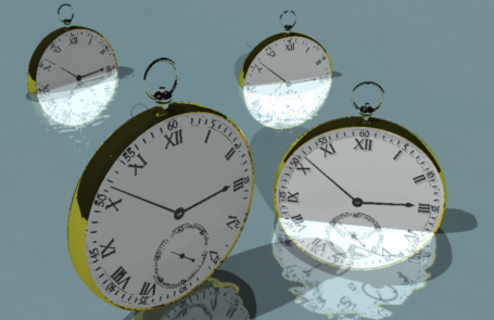
At a certain time it became convientent to reimplement the originial client in Java with a server component. Since RCP applications usually have a splash screen I had to to come up with something and played around with a 3D-renderer.


The original icons were easily migrated and reused.
Eventually people started to buy and develop on Mac systems. Seeing the poor icons in the dock I felt obliged to redo the icons from ground up.


As for now this is more or less the current Time4U logo on a "I'm not happy with but can live with" basis. Feel free to send me a better suggestion.
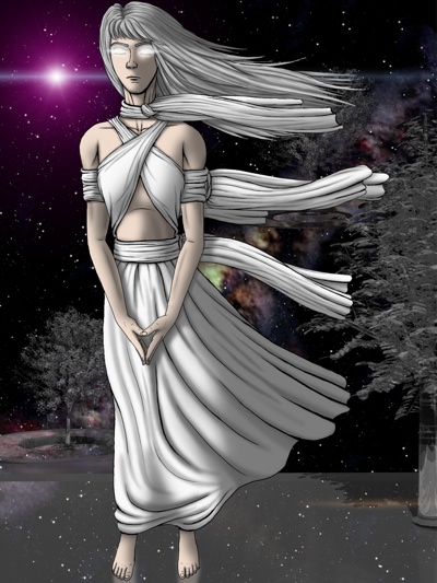
One weekend, after reading Terry Pratchett's "Thief of Time" - where the anthropomorphic personification of Time is a woman residing in a palace of glass - I came up with this

This version has never made it into the software. As side note (before I'm getting planed by Terry Pratchett fans): It's not even correct. In the book Time is a dark-haired.